The client requested the creation of a premium logo for G Point, an online store of intimate goods that combines style, aesthetics and delicacy. The task was to convey the sensuality of the brand through an elegant design without a hint of vulgarity.




Logo design for G Point
Portfolio category:
logo design

Our solution
We proposed an elegant and at the same time restrained approach that appeals not to provocation, but to sensuality and aesthetics.
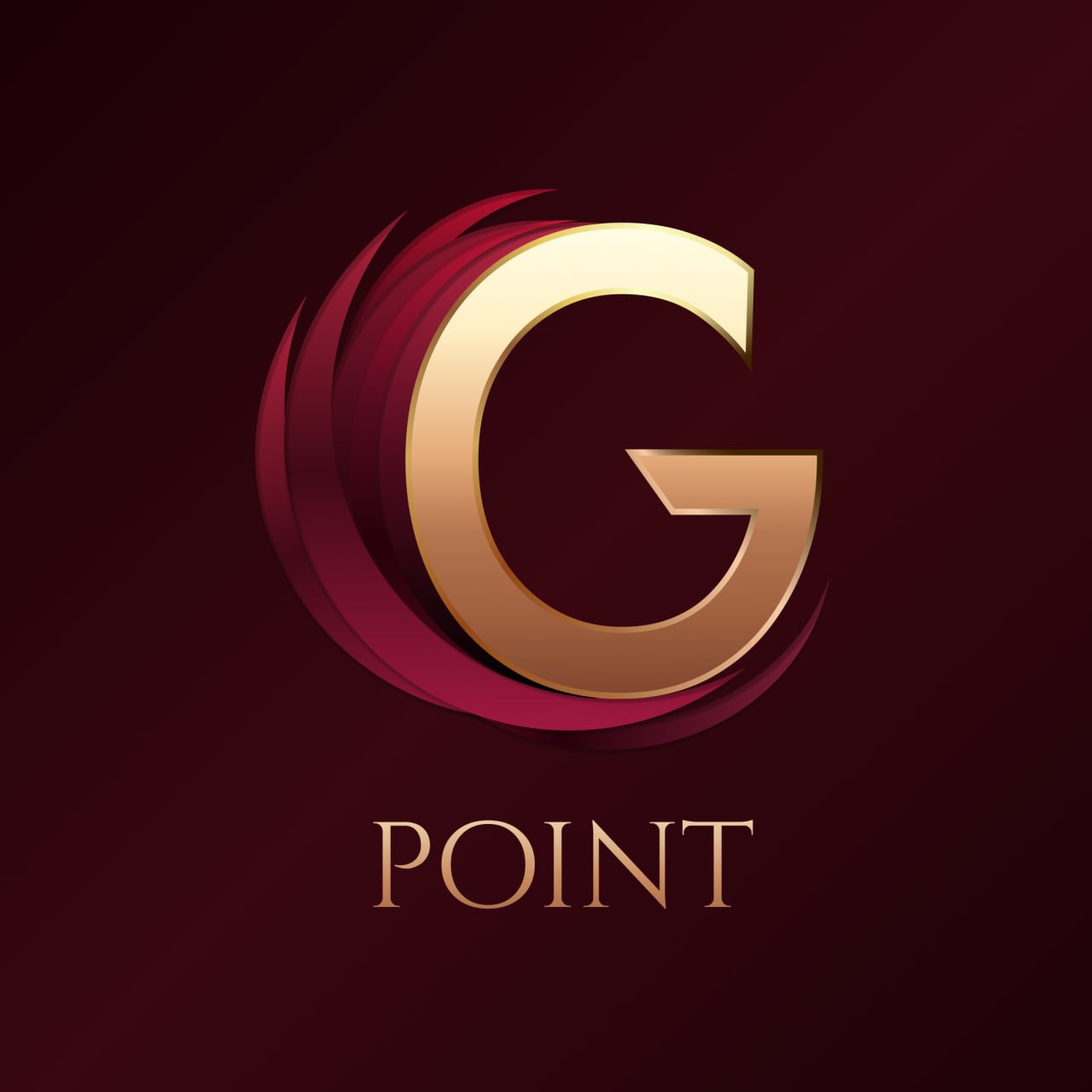
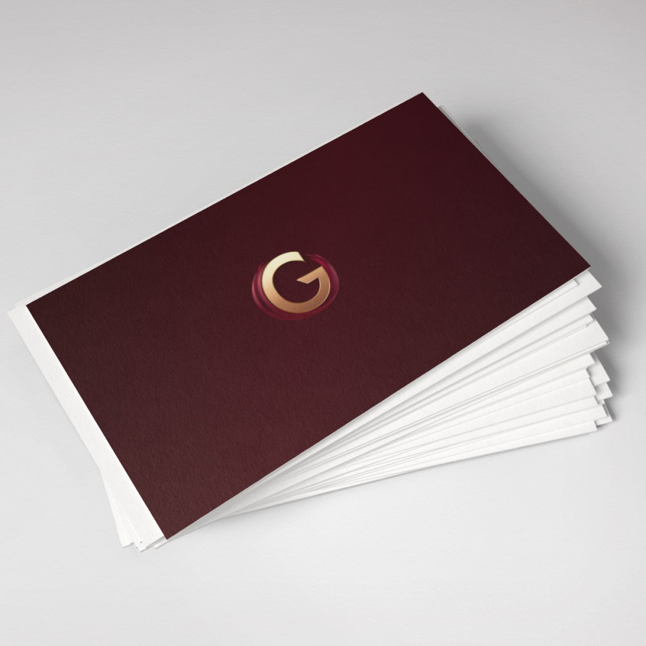
- Concept. The monogram with the letter G was chosen as the basis, which symbolizes the beginning of the brand and at the same time forms a recognizable sign. The three-dimensional ring framing the letter became a metaphor for harmony, unity and female energy.
- Style and forms. A combination of smooth lines and sharp cuts is used to create a sense of balance between tenderness and confidence.
- Color palette. Shades of burgundy, gold and powder pink create an atmosphere of luxury, intimacy and comfort. These colors are both attractive and trusting.
- Typography. The font with classic proportions emphasizes the status of the brand, while the elegant letters in the word POINT create an association with precision, completeness and elegance.
- Adaptation. We have developed several color and spatial versions of the logo for different formats — from packaging to online storefronts. The logo remains expressive even in monochrome.
As a result, we got a harmonious sign that conveys eroticism through shape and color, and not through direct associations. It looks expensive, attractive and completely appropriate within the framework of a modern brand for an adult audience.
How did the logo shape the brand atmosphere?
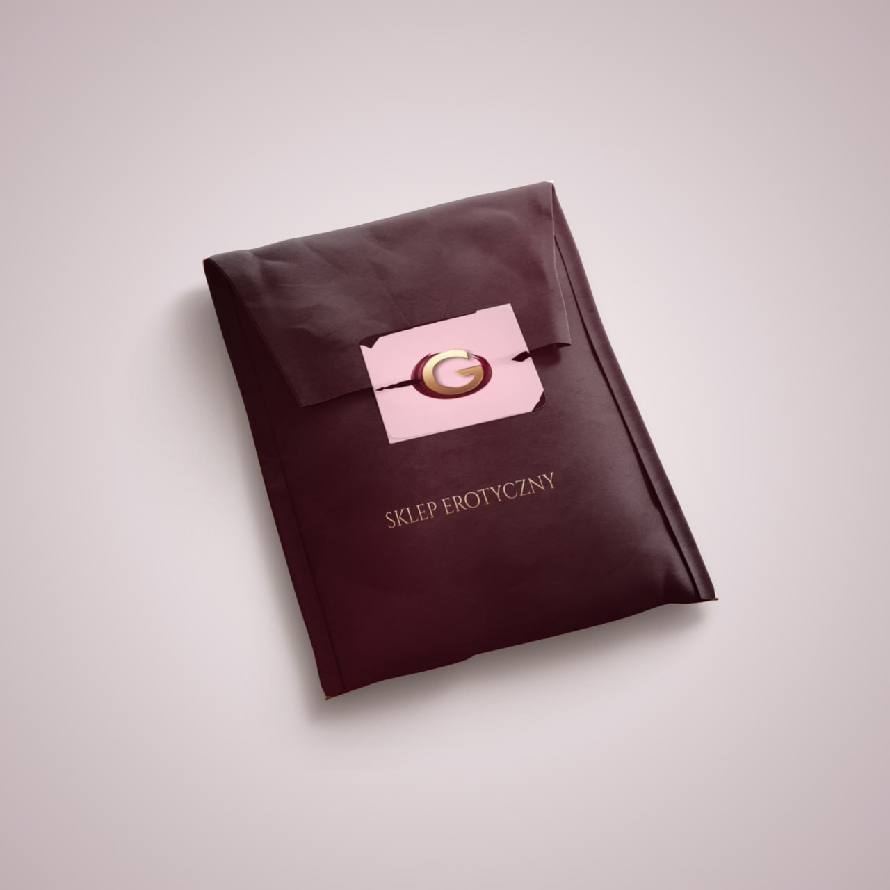
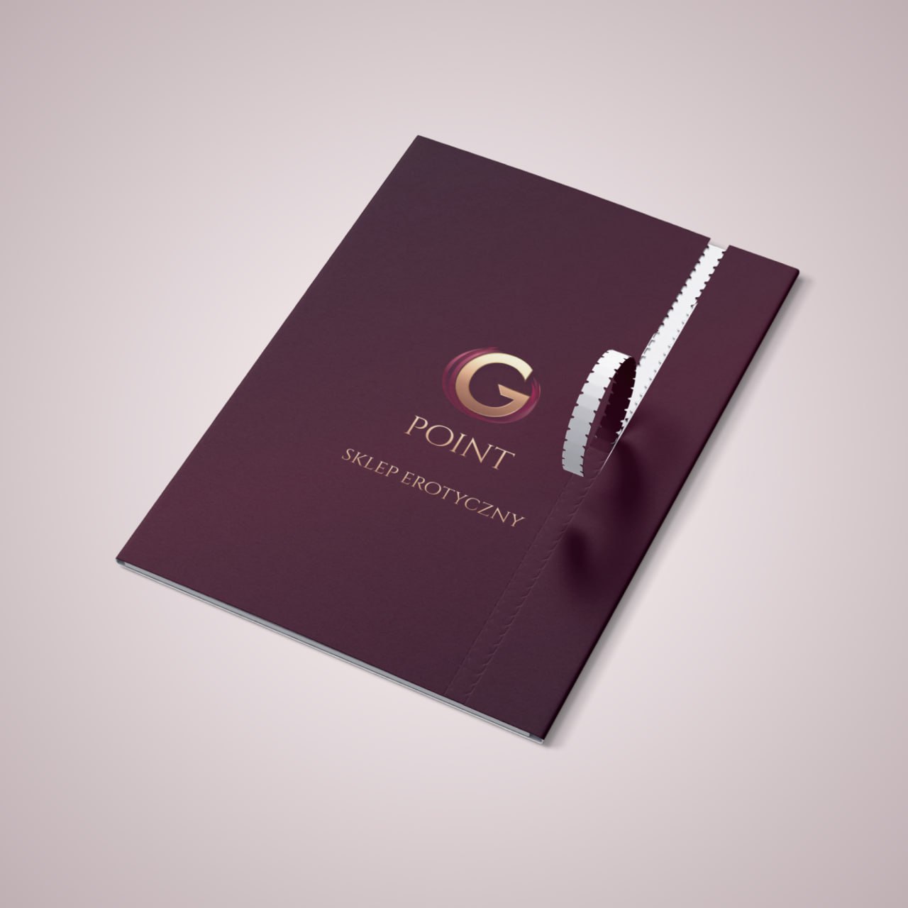
The new logo became the basis of the corporate style of G Point, which united all points of contact with customers – from the website to packaging.
- Warm metallic reflections in combination with deep burgundy create a premium mood.
- The monogram G is easy to remember and looks great as an icon or emblem on packages.
- The visual style conveys the aesthetics of delicacy — it does not speak directly, but hints with taste.
- Thanks to the colors and fonts, the design works equally effectively both in the digital space and on physical media: labels, boxes, business cards.
The logo became not just a mark of the store, but a symbol of its subtle philosophy – about pleasure, beauty and trust without excess.
We create a style that speaks without words
If your brand works in a field where it is important to combine emotions, trust and aesthetics, contact us. We’ll help you create a design that inspires curiosity and respect at the same time, leaving exactly the aftertaste you want to convey to your audience.