We were contacted by psychotherapist Oksana Cherikovska, who wanted to create a visual identity that conveys calmness, professionalism and trust. The main goal is to create a logo that combines the depth of psychological work with the warmth of human contact.




Logo for psychotherapist Cherikovska Oksana
Portfolio category:
logo design

Our solution
We decided to move away from cold medical symbols and create an image that would speak the language of emotions and inner harmony.
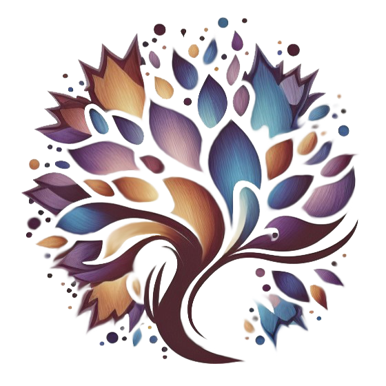
- Concept. The basis was the idea of the “tree of life” — a symbol of development, healing, and inner strength. Each branch and petal in the logo represents a person’s path to self-discovery.
- Form and composition. We chose smooth lines without sharp corners to emphasize the softness and kindness characteristic of the therapeutic process.
- Color range. The combination of deep purple, blue and warm beige shades creates an atmosphere of peace and hope. Such colors help to associate the brand with trust and stability.
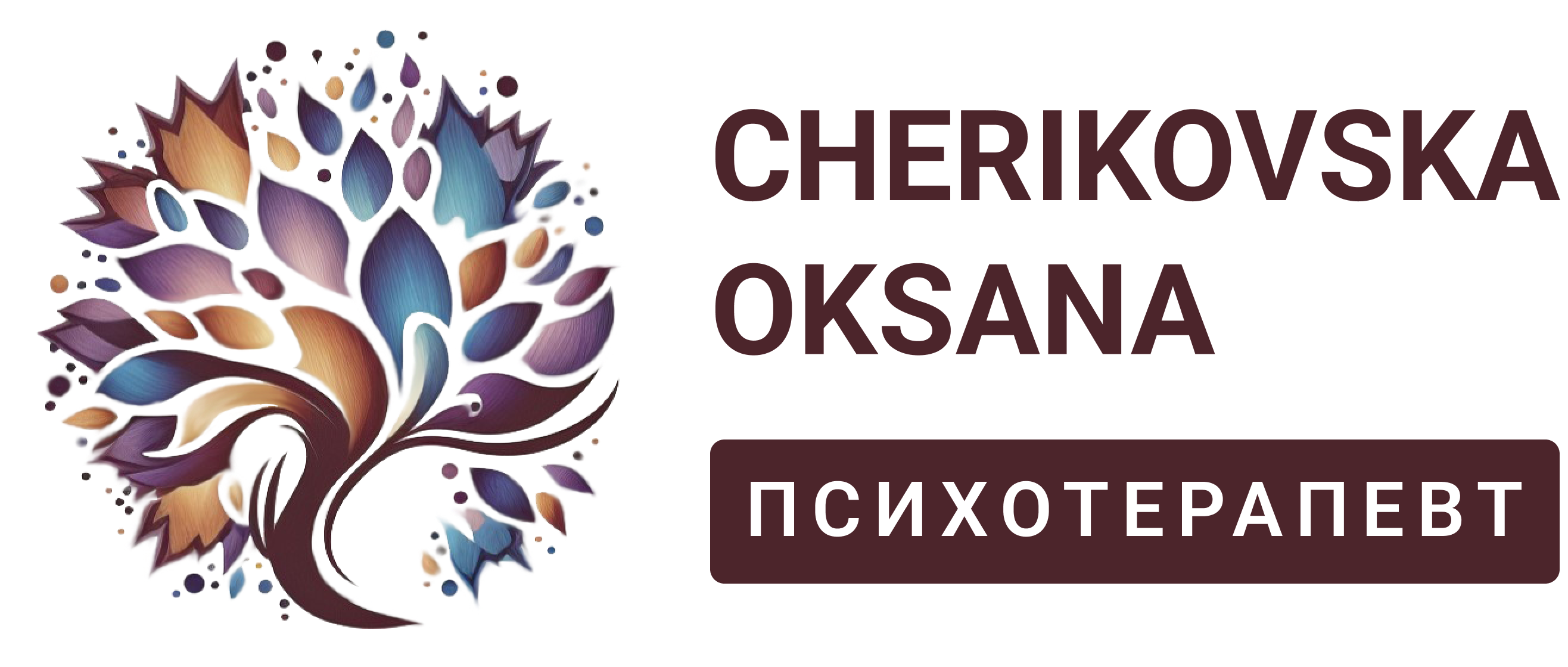
- Typography. The laconic, sans-serif font keeps it modern and reads confidently, even in a small format. Emphasis on the surname and profession (“Psychotherapist”) ensures a clear perception of the brand as personal.
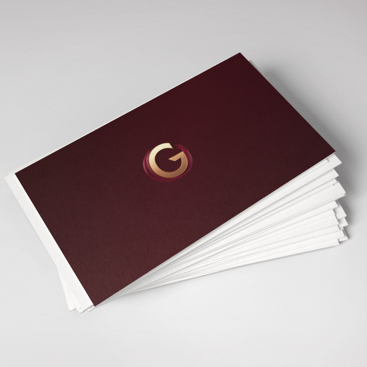
- Adaptation. The logo has two equal versions — a full one (with name and profession) and an icon in the form of a tree, which can be used in social networks, on business cards or corporate materials.
As a result, we got a harmonious combination of symbolism, color and minimalism. The logo looks artistic and restrained at the same time – it is not overloaded with details, but has a deep meaning that is easy to read at a glance.
How has the brand image changed?
The new logo created a visual image that works on trust even before the first meeting with the client.
- The tree symbol immediately evokes a feeling of peace, growth and harmony.
- Soft colors and textures add empathy, making the identity “alive”.
- The clear signature “Cherikovska Oksana / Psychotherapist” creates a feeling of openness and professionalism.
- In the digital space, the logo looks great on a white and dark background, and also harmoniously integrates into the website, social networks and printed materials.
The style of the brand became a visual reflection of the specialist herself – calm, deep, with an orientation towards development and internal balance.
Do you also want to convey the character of your profession through design?
We will help create a logo that will speak instead of words – warmly, precisely and to the point. Get in touch and we will develop an identity that will reflect your philosophy and inspire trust at first glance.