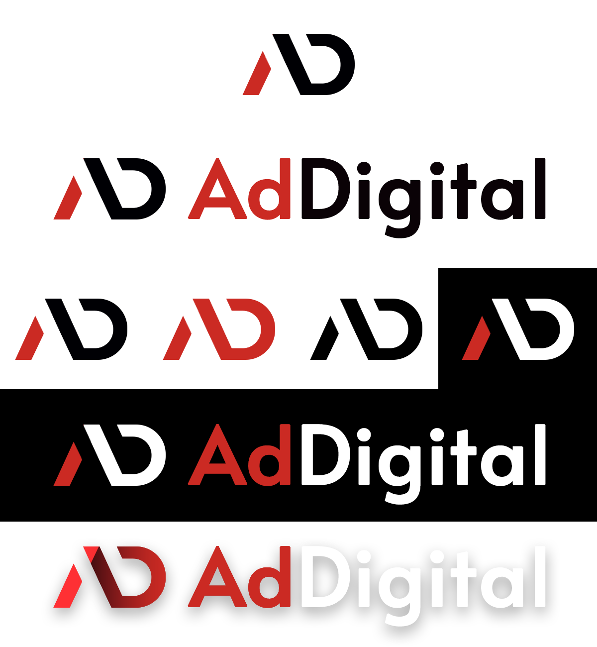
AdDigital is a marketing agency working in the field of digital promotion. The team wanted a logo that would reflect the energy of a technology business, but remain understated, modern and easily adaptable to any medium.




Logo design for AdDigital
Portfolio category:
logo design

Our solution
We created a minimalist logo based on a combination of simple shapes, clear lines and contrasting colors.
- Analysis of the brand. We determined the associations that most accurately convey the character of the company: speed, innovation, confidence.
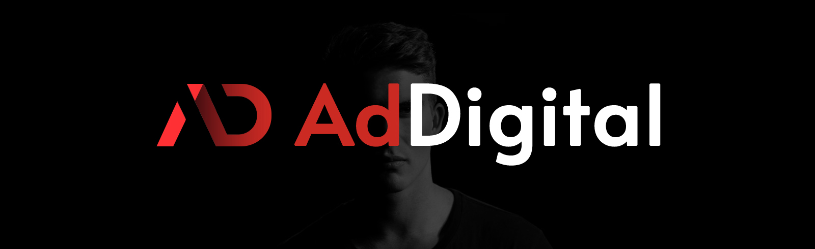
- Concept search. Among several options, the idea of the letter monogram AD won. The letter “A” conveys forward movement, and “D” creates a sense of completion and balance.
- Design and palette. Red color symbolizes energy and development, black – stability and strength of the brand. Several options have been created: with the text “AdDigital”, a separate monogram for use in social networks, and a dark version for presentations.
Result
The logo became the central element of AdDigital’s new branding and formed a coherent visual system, which the team began to actively use in all communication channels.
- The AD monogram is easily recognizable even without the text part – it has become an independent brand symbol that works well both on social media profiles and on merch.
- The contrast of red and black creates an energetic yet professional impression, helping you stand out from the competition while remaining within the bounds of a discreet corporate style.
- The typography looks modern, confidently and harmoniously combines with the logo, emphasizing the dynamics, technology and orientation of the brand towards development.
- Adaptive versions of the logo ensure stable recognition in any environment – on the website, in social networks, in emails, presentations, advertising materials and even in monochrome print.
- Thanks to a well-constructed identity system, the company received a unified visual style that is easy to scale along with business development: from advertising campaigns to a corporate website or outdoor advertising.
The created design became not just a graphic sign, but a visual reflection of AdDigital’s philosophy — a brand that combines technology, speed and flexibility in everything it does.
Want a similar result?
If you want to get a logo that truly conveys the essence of your company and looks professional in any format – contact us, we will help you create an identity that works for your brand.